Overview
The Content Library Widget in CloudFiles is designed to manage documents within a centralized content library page. It is ideal for organizing shared documents in one central location, making it easy to access, categorize, and maintain files for teams across an organization. The base widget appears as follows:
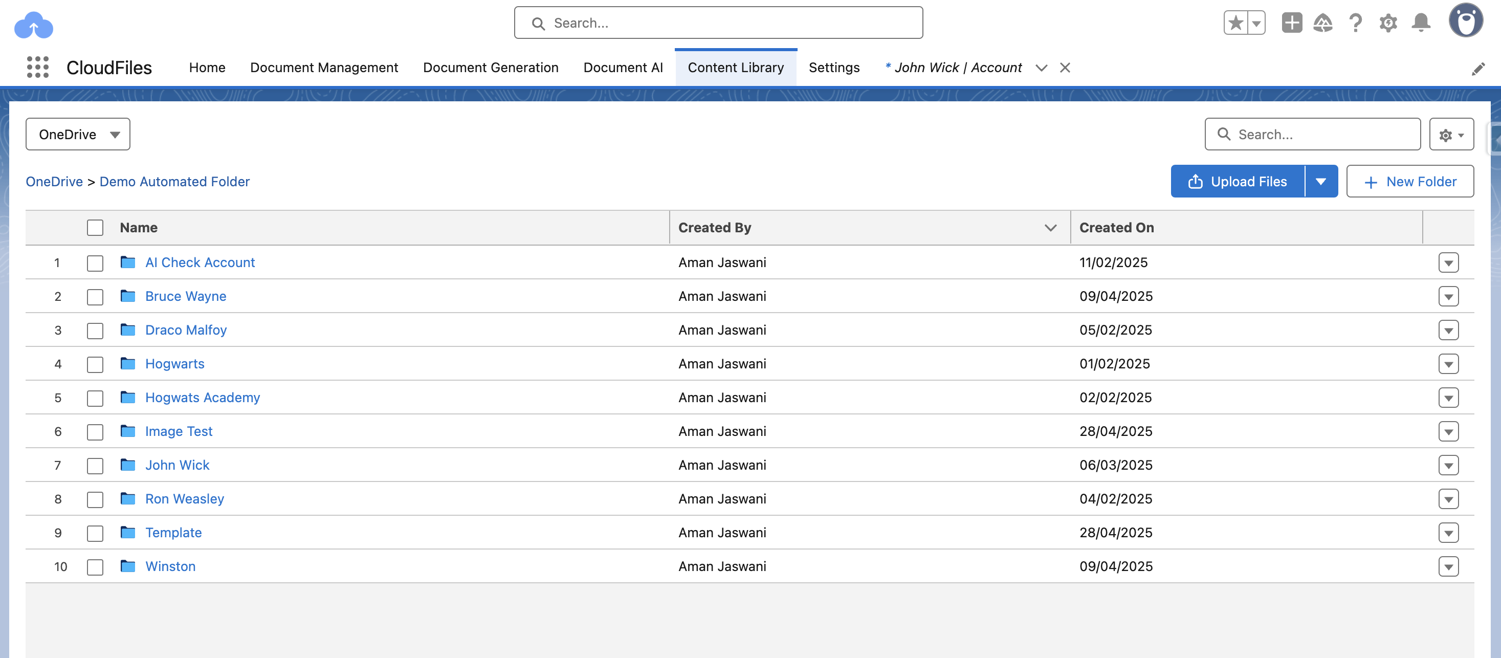
This guide walks you through the configuration options available for customizing the widget's behavior.
Creating Widget Configuration
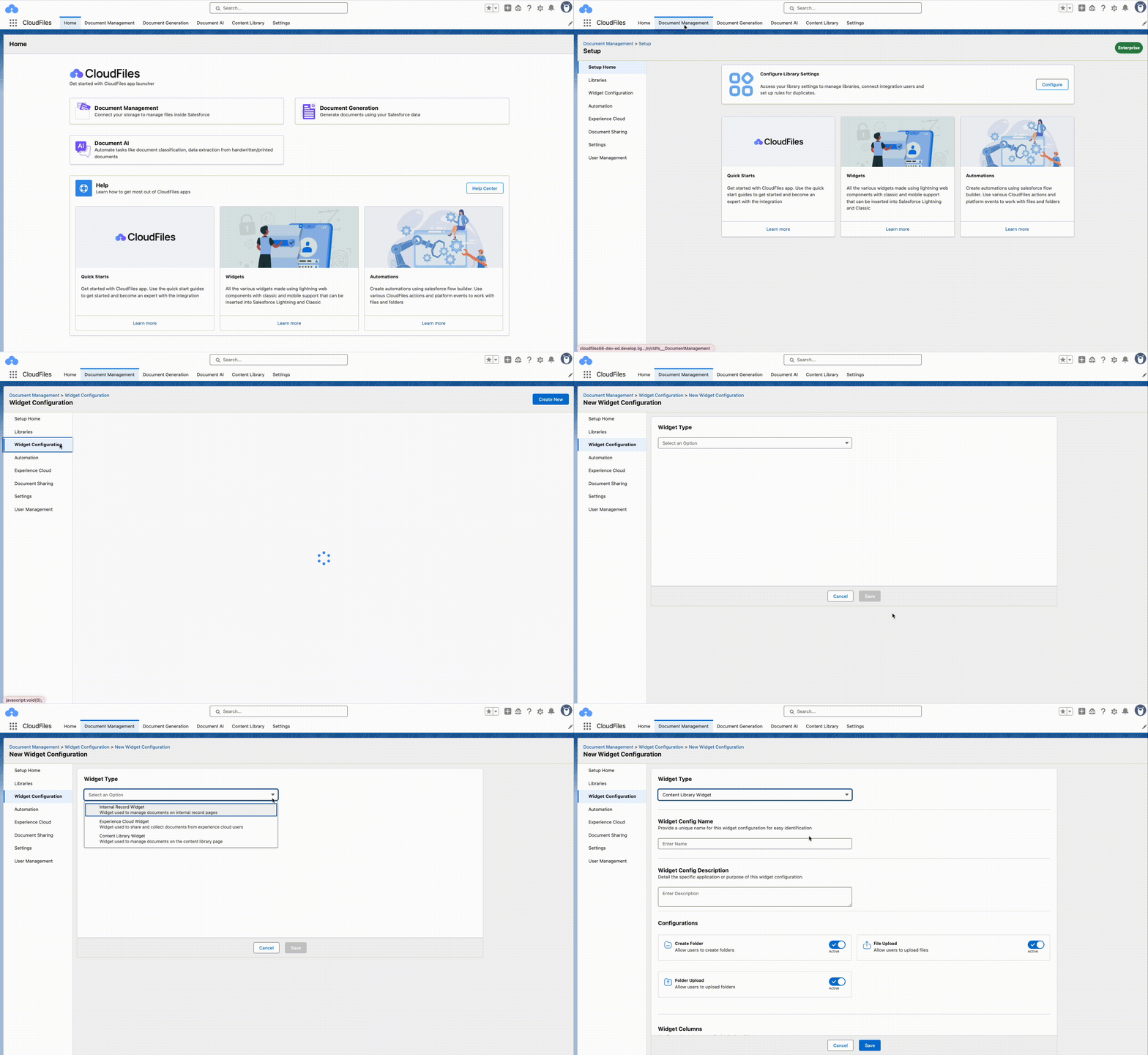
You can configure the widget as per your requirements by going to the CloudFiles App → Document Management → Widget Configuration → Create New → Content Library Widget. Once you select this widget type, you'll be guided through further settings to customize the widget. The setup steps are as follows:
Key Configuration Fields
1. Widget Config Name
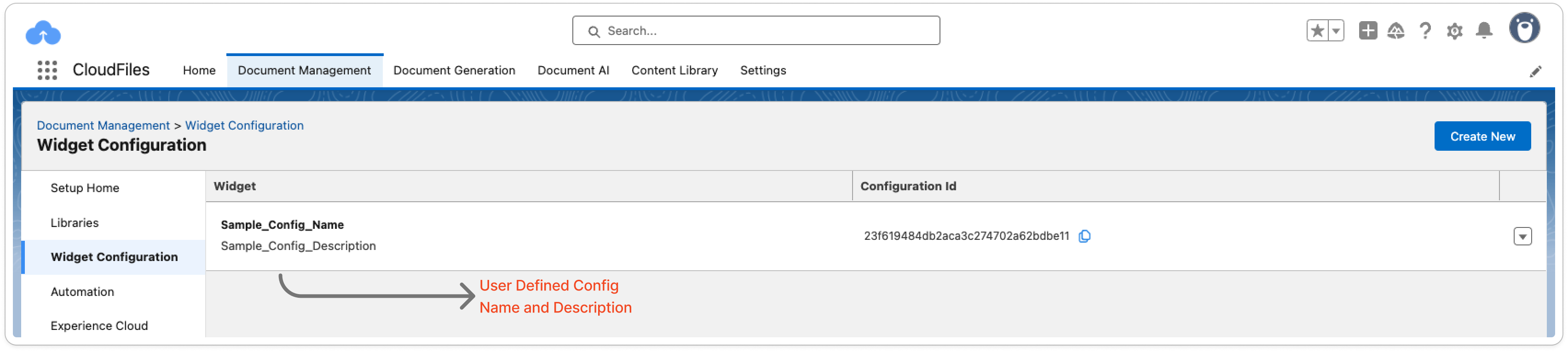
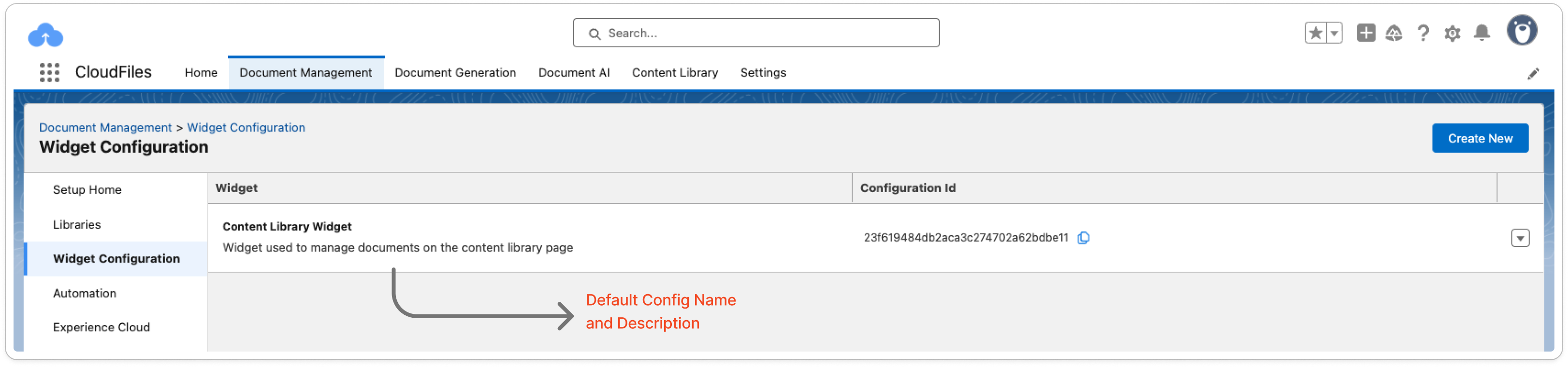
This field is used to assign a name to the configuration for easy identification. This name appears only in the “Widget Configuration” tab, and not on the content library page. This field can be left blank and the default value will be “Content Library Widget”.
2. Widget Config Description
This field is used to assign a short description to the configuration. This description will also appear only in the “Widget Configuration” tab. This field can be left blank and the default value is: “Widget used to manage documents on the content library page”.
3. Configurations
The control actions available in the widget can be toggled on or off here -
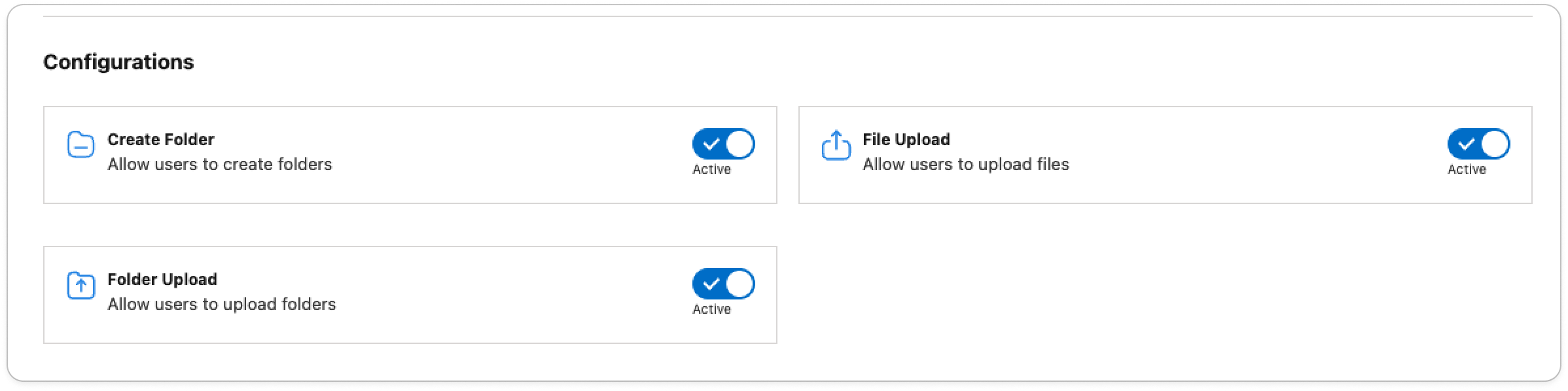
The 3 basic actions provided are -
- Create Folder: Enables the “New Folder” button to create a folder directly from the widget. Reduces context switching to go to the external storage. For detailed instructions, refer to Create Folder
- Folder Upload: Enables users to upload entire folders directly to the external storage.
- File Upload: Enables users to upload individual files directly to the external storage. For detailed instructions, refer to File and Folder Upload.
4. Widget Columns
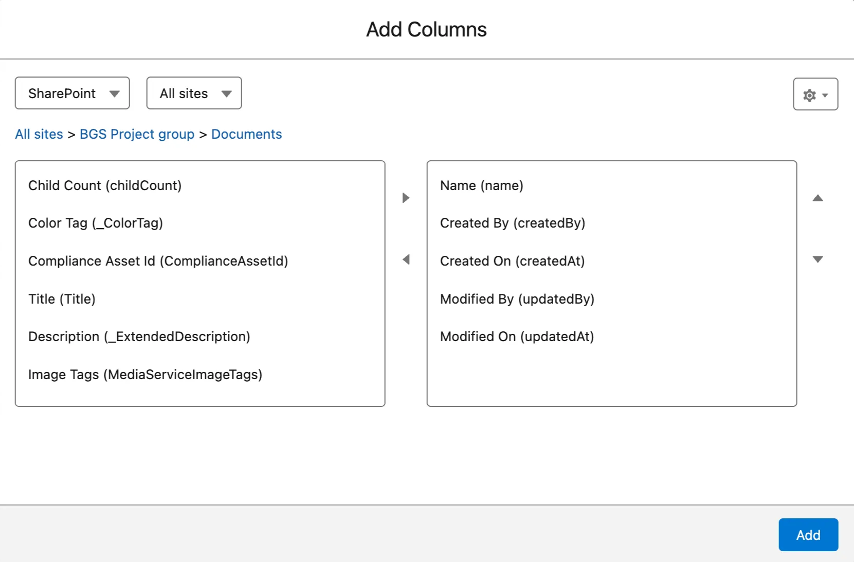
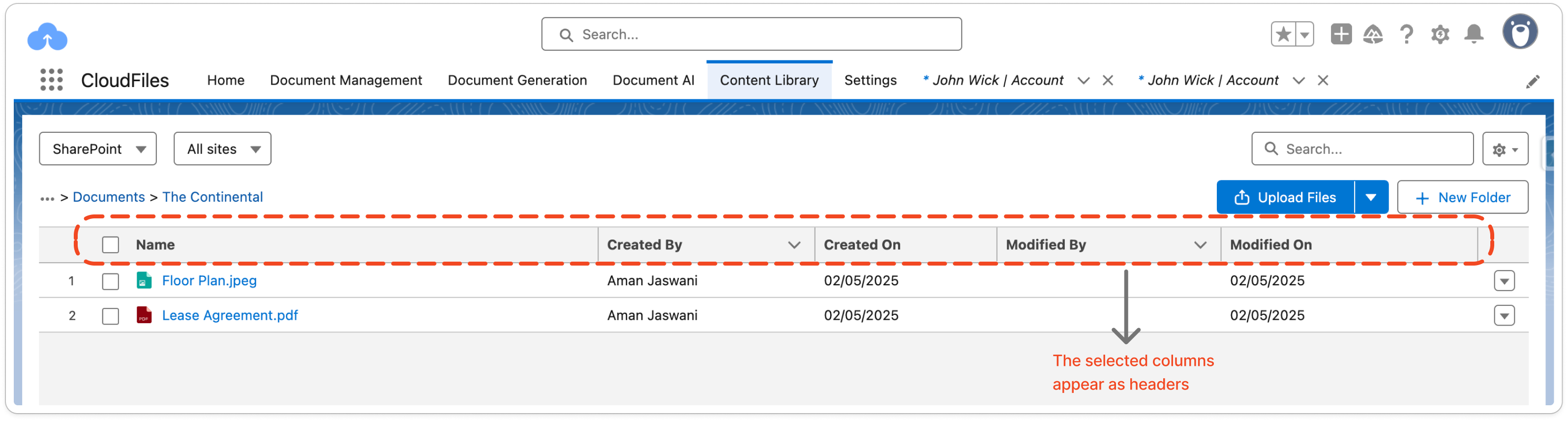
This configuration controls what column names will appear on the Content Library page. The available headers vary by external storage type — Google Drive, SharePoint, OneDrive, etc. Only the headers moved to the right side of the configuration screen will appear in the widget. If left blank, the widget defaults to displaying Name, Created By, and Created On headers.
The selected headers will appear on the content library page as follows -
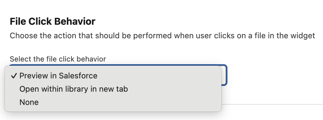
5. File Click Behaviour
The action that will occur after the user clicks on a particular file can be defined using this setting.
- Preview in Salesforce – Opens a preview pop-up window within the same page to view the file. This is also the default option.
- Open within library in a new tab – Redirects to a new tab and opens the file from within your shared drive.
- None – Disables file click actions, requiring users to manually download files to view them.
6. Widget Base Path
Use Base Path when you want a widget to show only a specific folder (or a few specific folders), instead of everything connected to the record. This is useful when a record has more than one folder shared to it and you only want a widget to show the one that's relevant, or when you want to keep people within one folder structure rather than letting them browse everything above it.
How to set it up
- Go to Document Management → Widget Configuration, and open the configuration you want to update (or create a new one).
- Scroll to Widget Base Path and click Add Paths.
- Browse to the folder you want the widget to show, and select it. You can add more than one folder if the widget should pull from a few different locations.
- Save the configuration, then apply it to the record page through Lightning App Builder.
Once set, the widget will only display files and folders within the paths you've added.
Common use cases
- Show a clean, restricted view instead of everything shared to a record. Maintain the folder structure while only surfacing what's relevant, keeping the view uncluttered and keeping people out of content they shouldn't reach.
- Reach beyond the connected folder — move files up into a parent. Without Base Path, users can only move files within the connected folder and its children. With Base Path pointed at a parent, that range widens to include the parent itself.
- Enforce one consistent folder structure across every record of an object type. Base Path is set once on a configuration and applies to every record using it, so every record of a given type opens into the same structure, regardless of who connected what to it.
We recommend reaching out to the CloudFiles support team to get this configuration defined accurately for your use case.
7. Resource Actions
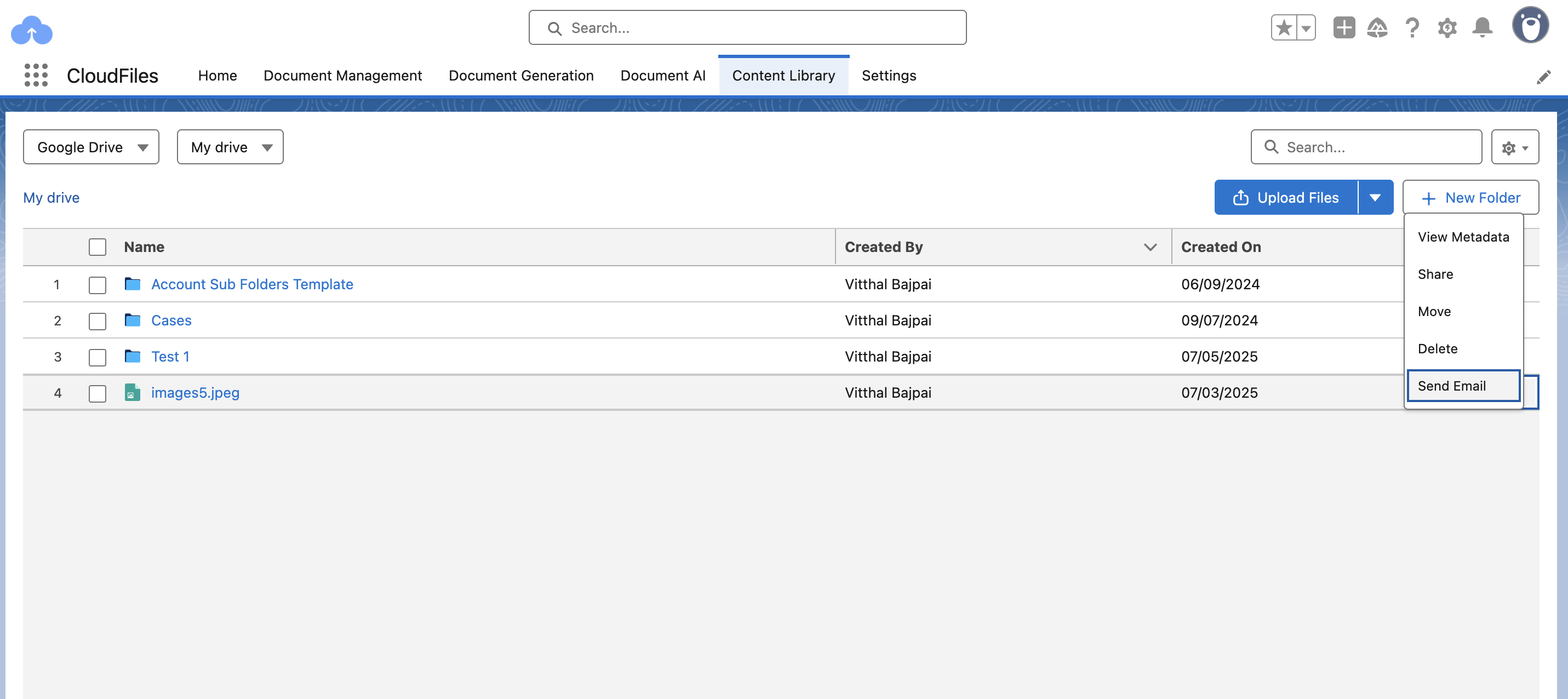
This setting defines the list of actions that can be performed on a specific file or folder within the widget. When a user clicks the dropdown next to a file or folder name, a list of default actions —such as View Metadata, Move, Share, Delete, etc. — is displayed.
In addition to these, admins can define custom actions using Salesforce Flows. These custom actions can be added to the same dropdown list and offer extended functionality based on business needs. Flows can either be autolaunched (running in the background without user input) or screen flows (which involve user interaction).
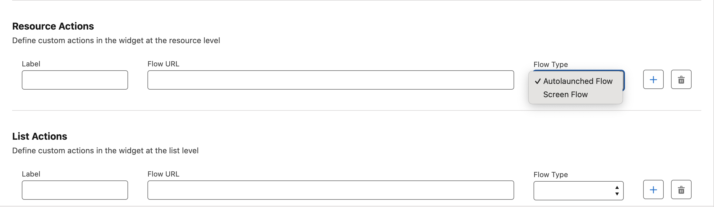
For example, a custom action could allow users to attach a selected document directly to an email, triggered right from the widget. The default and custom actions appear on clicking the dropdown beside the file name -
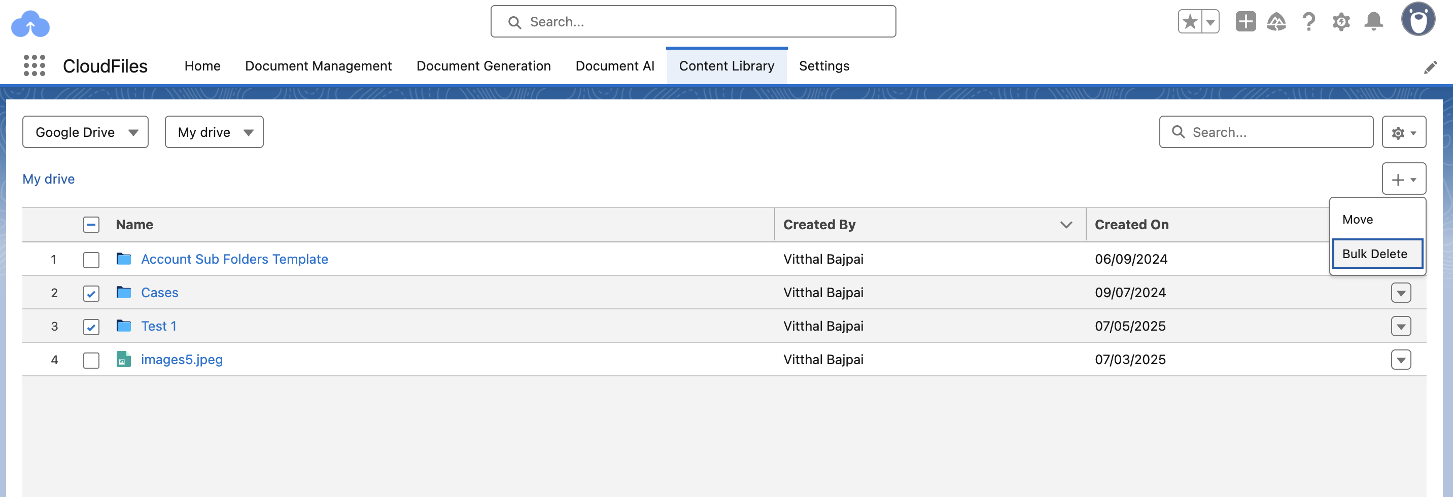
8. List Actions
List actions work like resource actions but apply to multiple selected files or folders. Only “Move” option is provided as default, but other custom actions like “Bulk Delete” can be set up using user-created flows. You can also search for a set of files using the search bar on top of the widget, and perform your custom action on the selection.