Overview
The Experience Cloud Widget offers a secure way to share and collect documents from users on Salesforce Experience Cloud sites. It’s built for external engagement, giving community users like partners and customers the ability to manage files without needing access to your internal Salesforce setup. The base widget appears as follows:
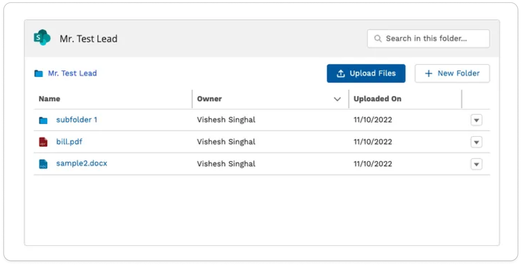
By connecting cloud storage platforms (such as Google Drive or SharePoint) with Salesforce records and Experience Cloud pages, the widget streamlines document flow between internal teams and external stakeholders. It also supports extensive configuration options, allowing admins to tailor user permissions, visible folders, and available actions to fit specific business needs.
Creating Widget Configuration
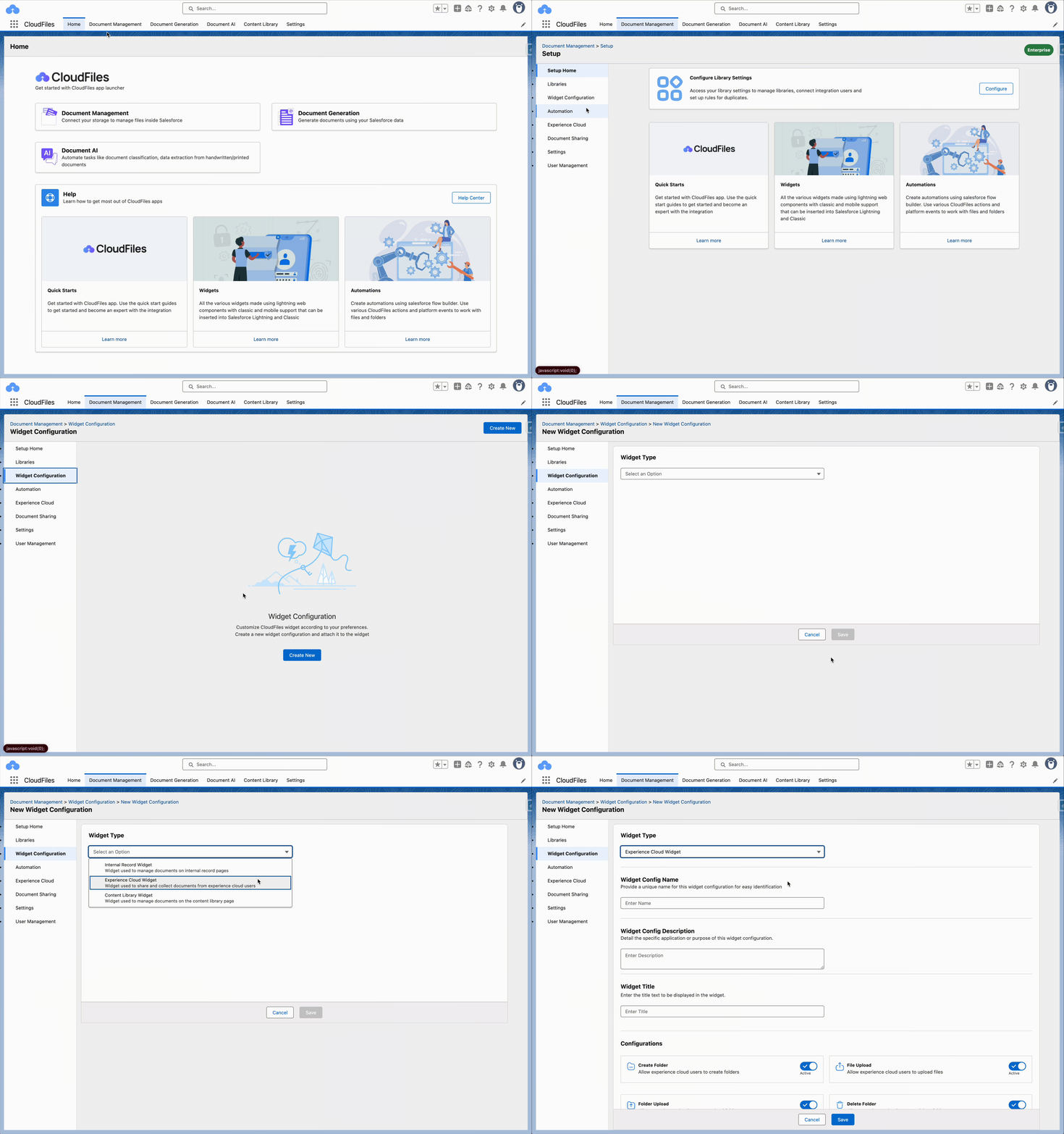
You can customize the appearance and behavior of the widget by creating your own configurations. To create custom configurations, open the CloudFiles app in Salesforce, go to Document Management → Widget Configuration → Create New → Experience Cloud Widget
Using the Widget Configuration
To use the created configuration, copy the Configuration ID from the widget configuration page, head over to the Experience Cloud Builder, select the CloudFiles component, paste the ID on the right hand panel, and finally save and publish the site.
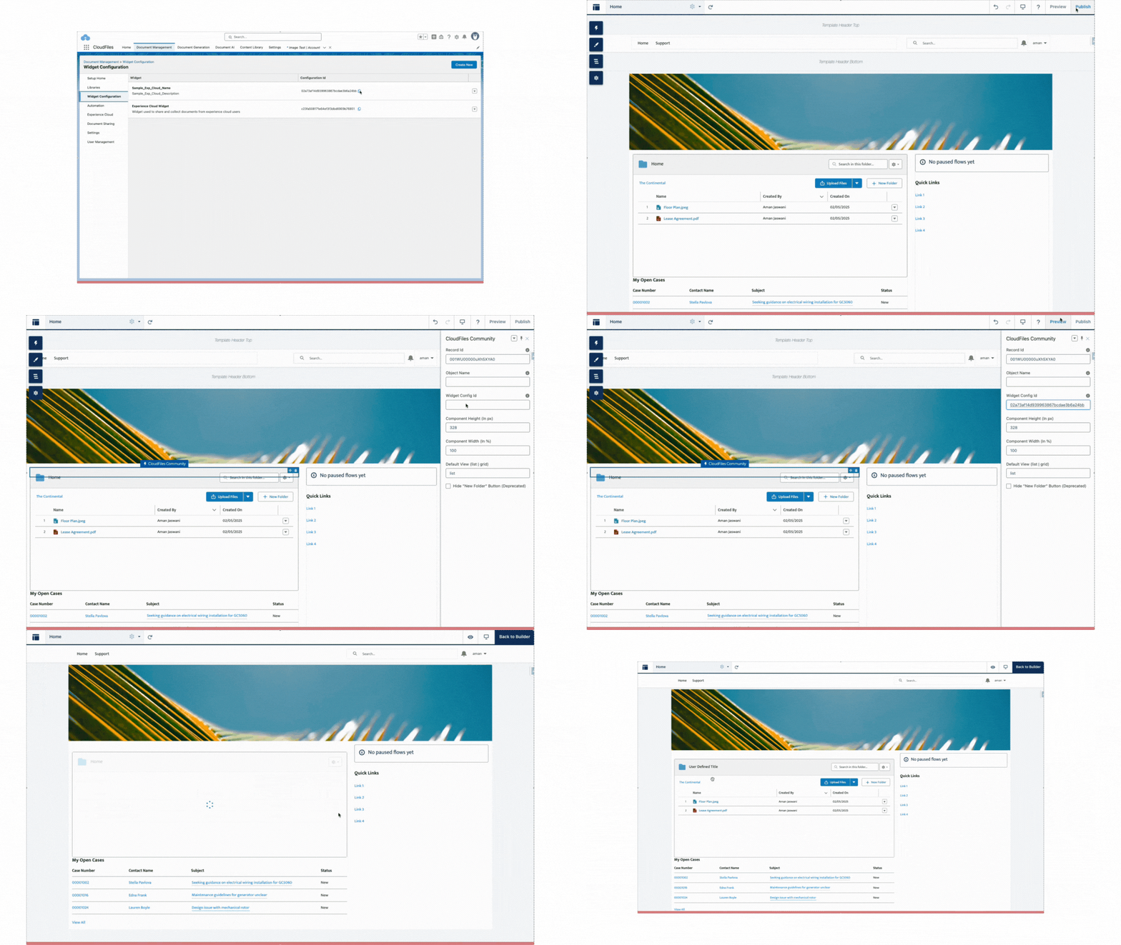
This method of adding widget configuration is applicable to the Experience Cloud widget type. For other widget types, refer to the appropriate widget in the Widget Configuration Guide.
Key Configuration Fields
1. Widget Config Name
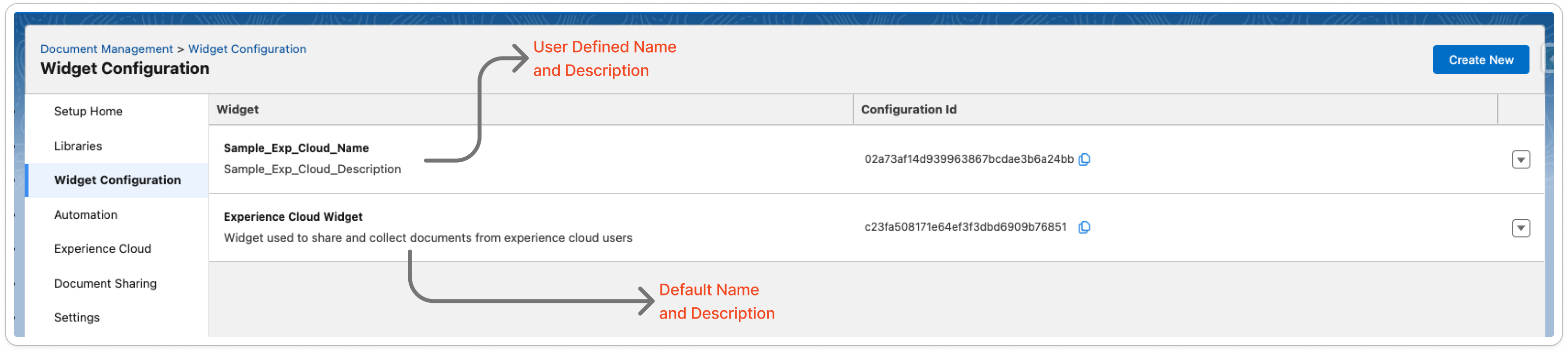
This field is used to assign a name to the widget configuration. It helps administrators identify and manage different configurations within the “Widget Configuration” tab. It does not appear on the actual widget seen by Experience Cloud users.
2. Widget Config Description
Use this field to provide a brief description of the use case or scope of the configuration. It is visible only to admins in the “Widget Configuration” list view and can help clarify which community or object it supports.
3. Widget Title
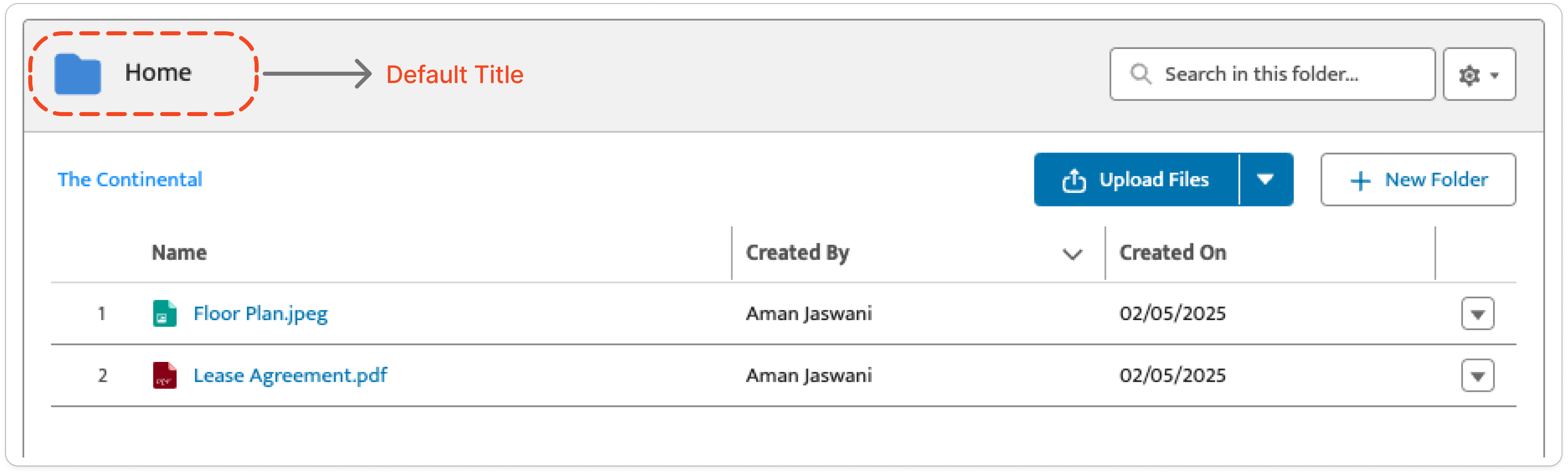
This is the title that will appear on the widget as seen by end users within the Experience Cloud page. If this field is left blank and a single folder is connected, or if multiple folders are connected without a title, the widget displays “Home”. If a custom title is defined here, it will override default behavior and appear as the static title.
4. Configurations
These are the actions that external users (Experience Cloud users) will be able to perform within the widget. You can toggle each one ON or OFF based on what level of control and functionality you want to offer.
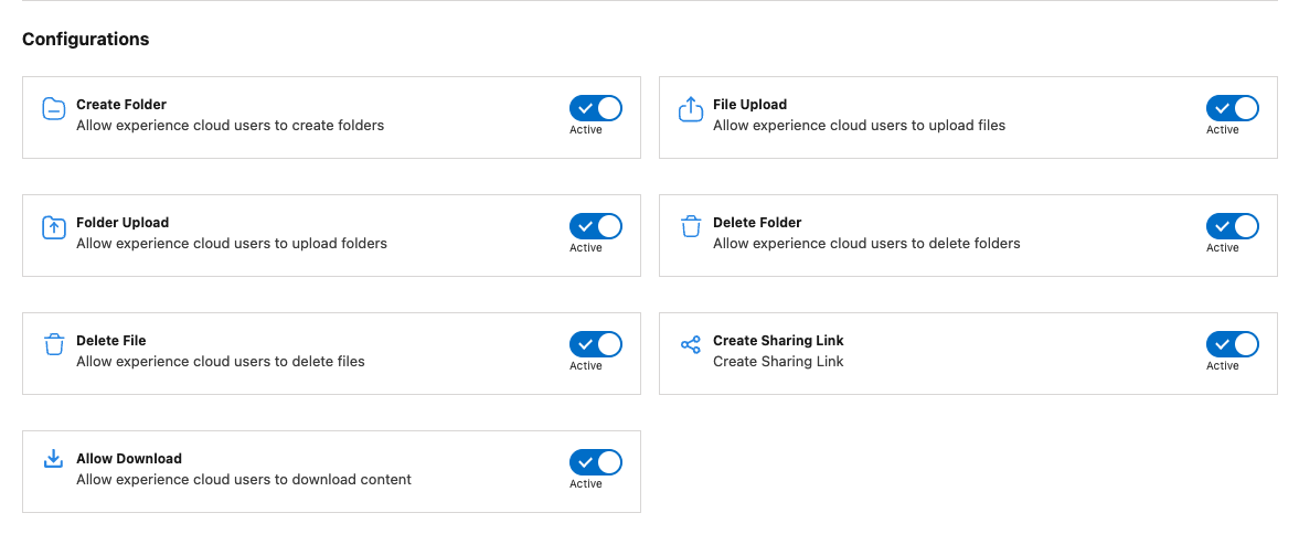
Supported actions:
- Create Folder – Adds the “New Folder” button for creating folders directly.
- File Upload – Allows uploading individual files to the selected directory.
- Folder Upload – Enables full folder uploads from the local device.
- Delete Folder – Permits folder deletion from the widget.
- Delete File – Lets users delete uploaded files.
- Create Sharing Link – Generates a shareable link for public access.
- Allow Download – Enables the download option on files within the widget.
5. Widget Columns
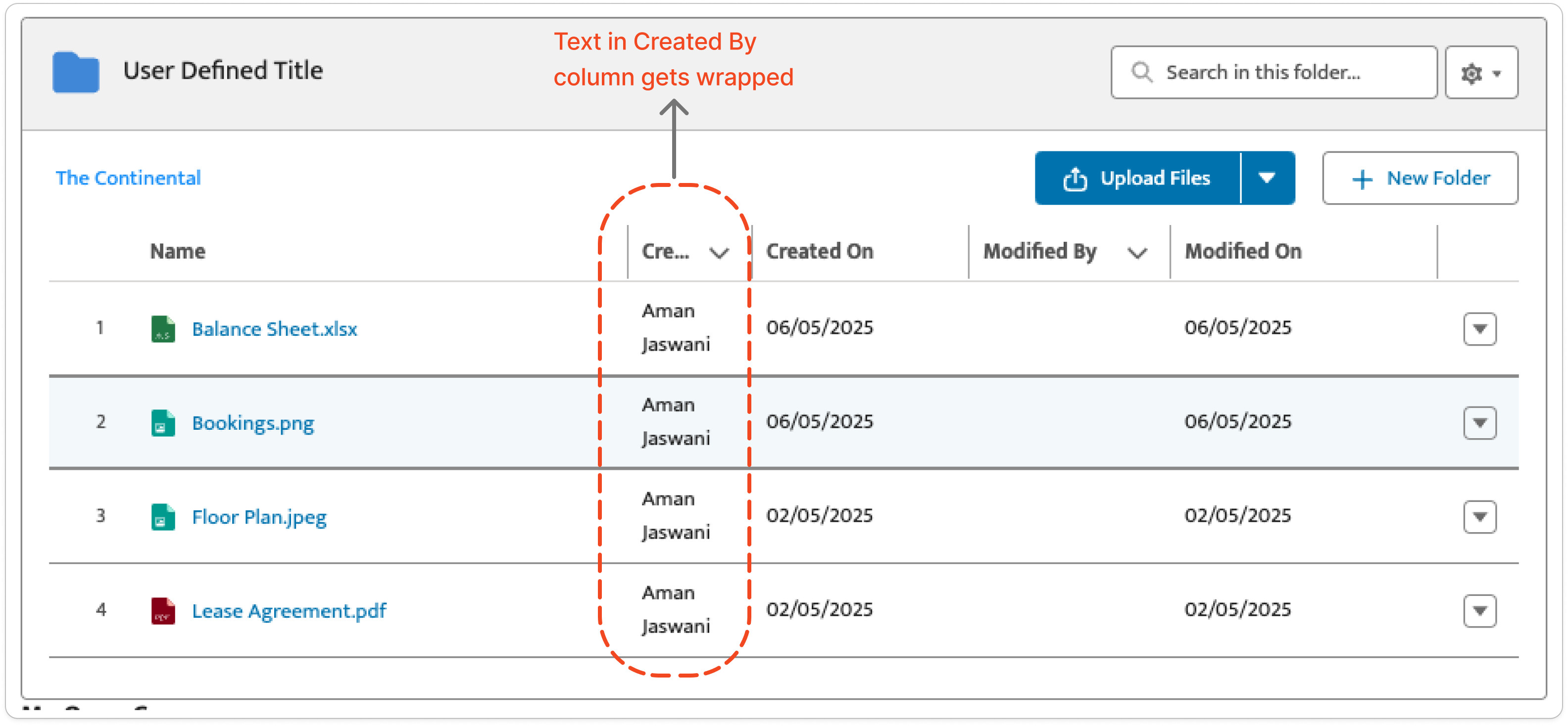
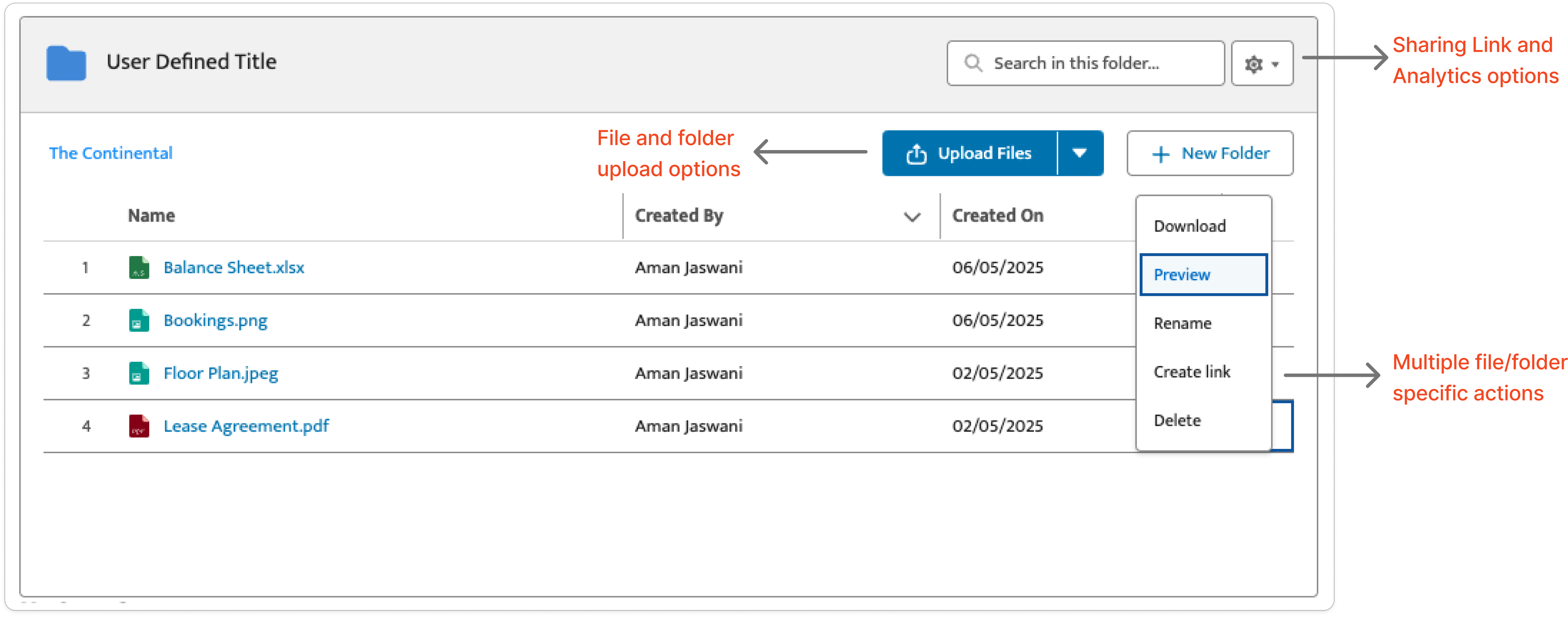
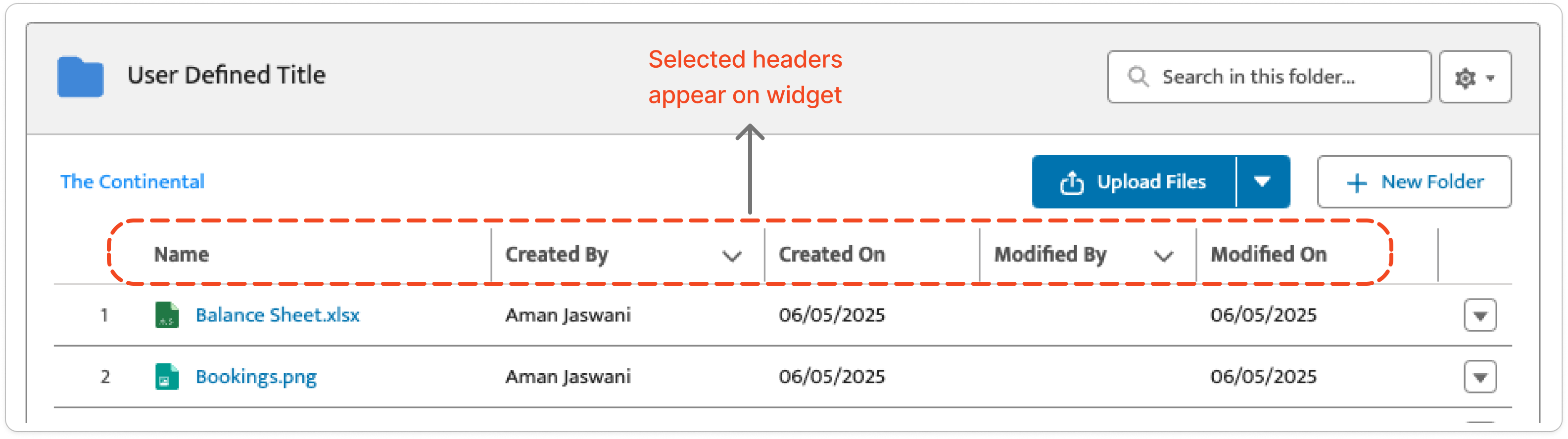
Defines which metadata columns (headers) are visible in the widget’s file list view. Common headers include - Name, Created By, Created On, Modified On, etc. Headers vary slightly depending on the external storage provider (e.g., Google Drive, OneDrive). Only headers moved to the right panel of the configuration screen will be shown in the widget. If left blank, default headers will be shown: Name, Created By, Created On.
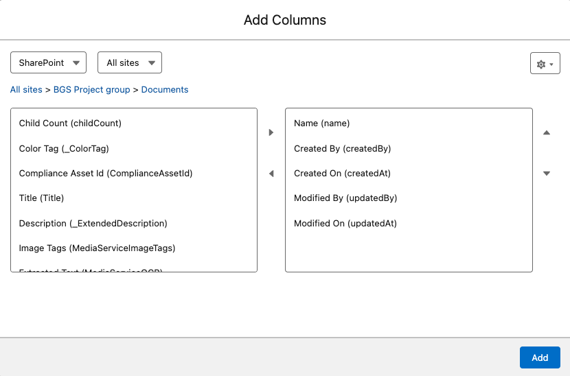
Here’s how the widget shows the columns that have been selected above -
6. Mandatory Widget Columns
This setting enforces required metadata fields when files or folders are uploaded by Experience Cloud users.
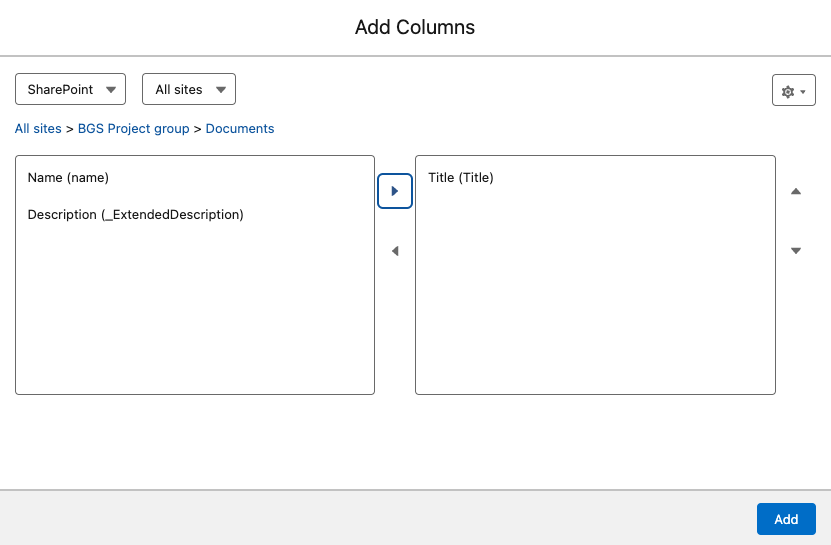
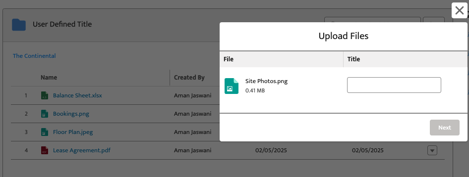
For example, setting “Title” as mandatory means the user must enter a title during upload. This ensures important metadata is always captured before files are saved.
7. Widget Base Path
Use Base Path when you want a widget to show only a specific folder (or a few specific folders), instead of everything connected to the record. This is useful when a record has more than one folder shared to it and you only want a widget to show the one that's relevant, or when you want to keep people within one folder structure rather than letting them browse everything above it.
How to set it up
- Go to Document Management → Widget Configuration, and open the configuration you want to update (or create a new one).
- Scroll to Widget Base Path and click Add Paths.
- Browse to the folder you want the widget to show, and select it. You can add more than one folder if the widget should pull from a few different locations.
- Save the configuration, then apply it to the record page through Lightning App Builder.
Once set, the widget will only display files and folders within the paths you've added.
Common use cases
- Show a clean, restricted view instead of everything shared to a record. Maintain the folder structure while only surfacing what's relevant, keeping the view uncluttered and keeping people out of content they shouldn't reach.
- Reach beyond the connected folder — move files up into a parent. Without Base Path, users can only move files within the connected folder and its children. With Base Path pointed at a parent, that range widens to include the parent itself.
- Enforce one consistent folder structure across every record of an object type. Base Path is set once on a configuration and applies to every record using it, so every record of a given type opens into the same structure, regardless of who connected what to it.
We recommend reaching out to the CloudFiles support team to get this configuration defined accurately for your use case.
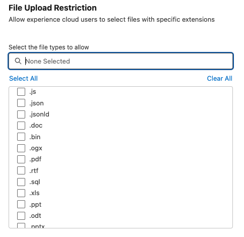
8. File Upload Restrictions
Use this setting to define what file types are allowed to be uploaded. By default, all file types are permitted. Once specific formats (e.g., pdf, docx) are selected, only those will be allowed, and others will be blocked from being uploaded. This is useful for controlling content quality and reducing storage clutter.
9. List View Controls
Controls how long text is displayed in the file/folder list view, especially for columns with lengthy values. Two options are available:
- Clip – Truncates overflowing text with ellipsis
- Wrap – Displays the entire text over multiple lines
This can improve readability or optimize space depending on your UI layout. Please note that this configuration is only applicable for columns that have dropdown arrow beside the header.